Do Better Church

Do Better Church | @dobetterchurch
Do Better Church (@dobetterchurch) is an organization dedicated to coming alongside survivors of abuse in the church or Christian nonprofit context.
Data Pipeline
Social Media: The Do Better Church instagram account has regular posting and activity where Jo Luehmann (@joluehmann) and various volunteers share stories from the survey as instagram posts, and Jo also shares relevant commentary and links in the “instagram stories” section of the account, along with useful links and resources in the “Highlights” section.
Survey: A survey on Google forms called @doBetterChurch | Christian Church Abuse. The survey questions are:
- What’s your name?
- Name of church or organization:
- What city and state, or country is the church in?
- What role did you play? (Check all that apply, if none apply elaborate in the “Please share what you’d like here:” question)
- What years did you work at the church?
- What type of abuse did you experience? (Check all that apply. If none apply elaborate in the “Please share what you’d like here:” question)
- This abuse was brought to…
- Please share what you’d like here:
- I would like for an advocate to follow up with me with options to hold this church accountable (email is required for follow up)
- What is a your email? (Email is required for follow up)
- May we share a piece or pieces of your story anonymously under the @DoBetterChurch on Instagram,Twitter and FB? No names of churches or individuals will be mentioned unless you expressly say you want that.
- What are the church’s social media handles? (this is if you want us to tag them)
- I would like to partner with you in my healing journey (email is required for follow up)
Storage: The survey data is stored in a corresponding google sheet.
Data Cleaning
The survey data is messy, because there were no constraints initially for the input fields. City, State, and Country, for instance, accept a variety of misspellings or capitalizations, the years involved question allowed for users to input “6 months” when we were hoping for a year range, to see differences among reports over specific year ranges.
Example of cleaning tasks for the data:
- Reformatting date ranges to be ####-#### manually
- modifying the locations to be recognized by Tableau
- Making sure all of the abuse lables match over several survey versions
- Modifying the names of the churches or organization to a common name (Village Church vs. The village church, etc)
Data Presentation and Visualization
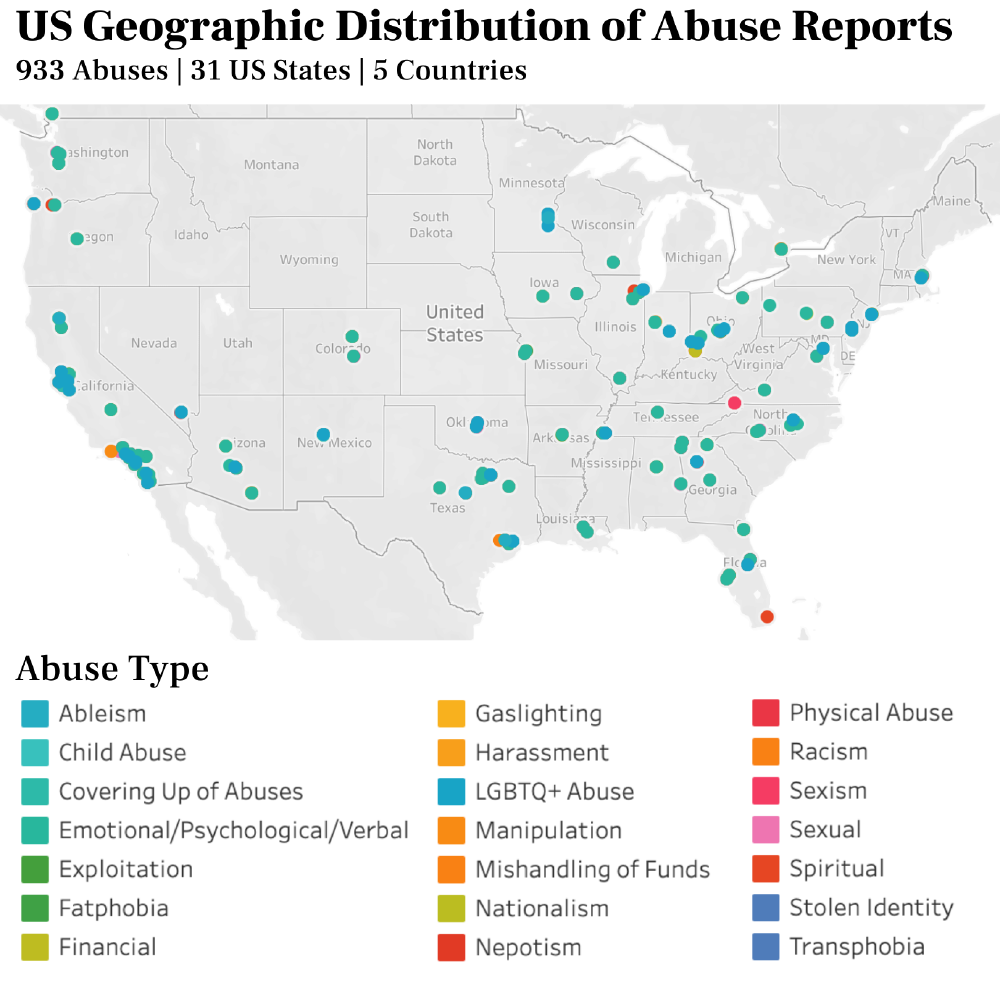
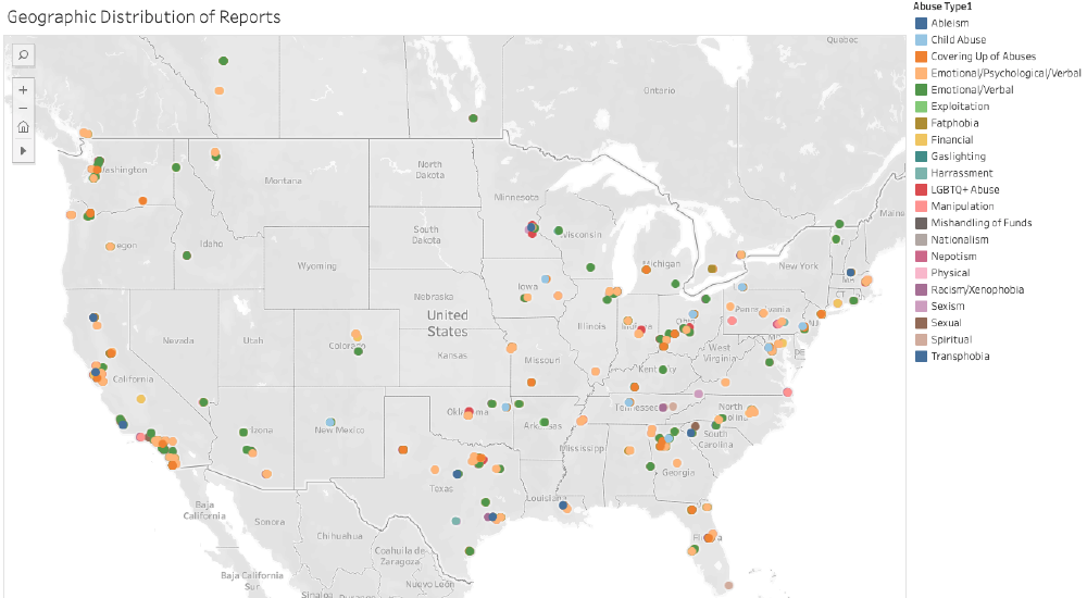
Geographic Distribution of Reports - Interactive Map: Because Tableau has different expectations for the input csv file, I have two scripts: one to subset the data, and one and clean to accommodate Tableau’s requirements.
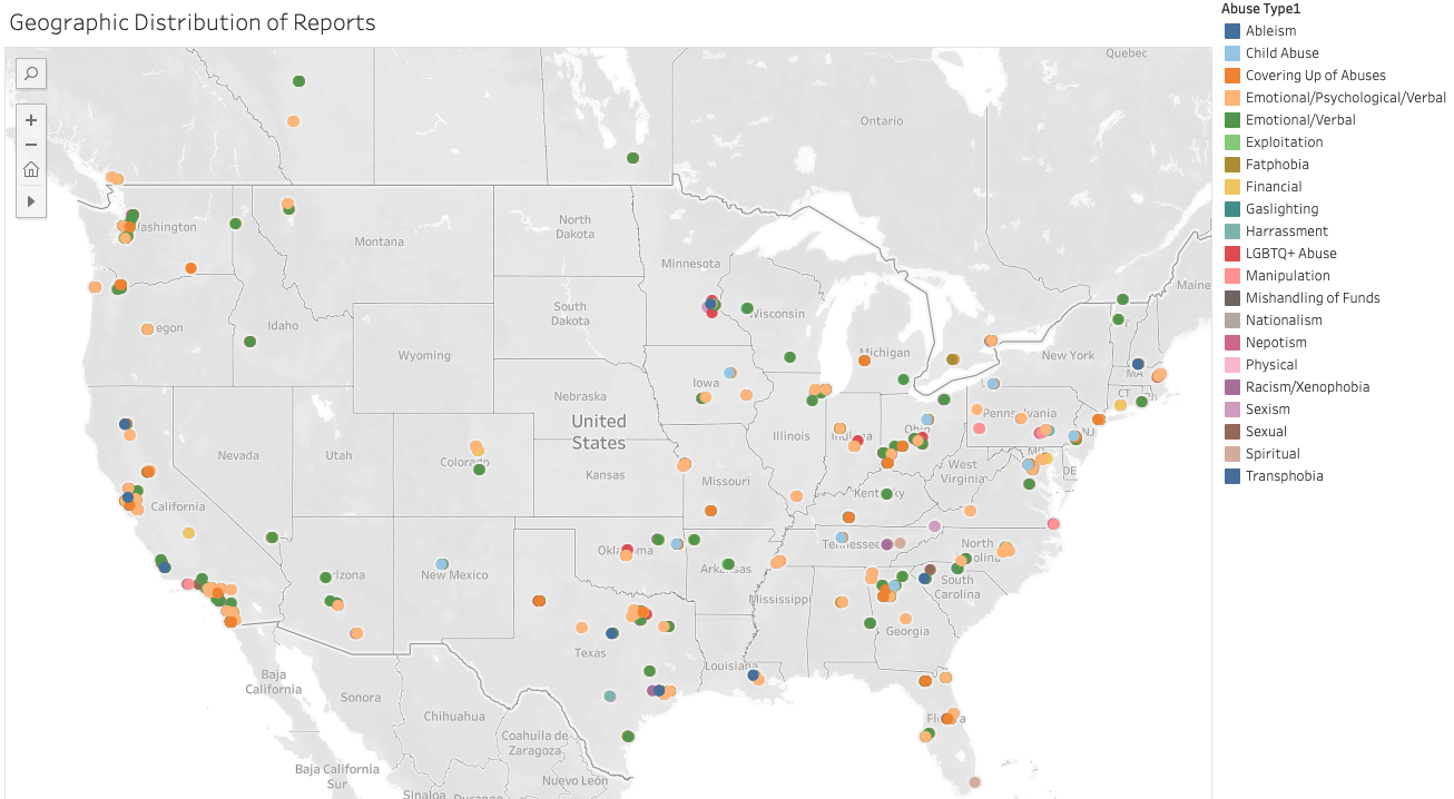
Source: Tableau Public - Geographic Distribution of Reports
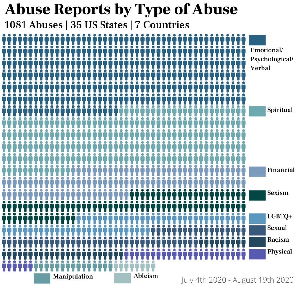
Abuse Chart: Using the library PyWaffle, the script name_of_script generates a waffle chart of abuse cases grouped by abuse. To render the chart in a way that is appropriate for instagram, the number of columns and rows, and the padding along the custom shape (the person icon) is necessary. I have one script to generate the legend (which sloppily has a distorted graph in the background) and one to generate the graph, without the legend. If the image to be generated doesn’t need to be ready for an instagram post, then simply choosing the appropriate number of rows and columns is sufficient, and the legend will show in whatever location specified in the parameter. (image in carousel above)
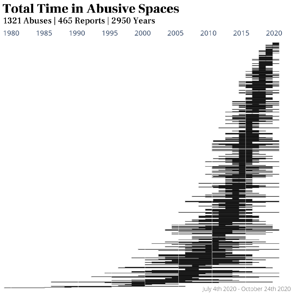
Time In Abusive Spaces: Using plotly’s chart-studio, I produced a plot of all of the time each person spent in the abusive space they reported. (image in carousel above)
Scheduling Data Updates
I am hoping to schedule jobs using GCP or Jenkins, but until the recurring jobs are operational, I have a simple cron job, here is the portion that reports the number of new reports each day.
Simple cron job
echo "Update successfully completed at: " >> output.txt
date >> output.txt
cd /path/to/dobetterchurch/scripts
X=$(grep -iEo '\d+\/\d+\/\d+' clean_survey_data.csv | wc -l | sed -e 's/^[ \t]*//') # number of current reports
/Users/jakeanderson/opt/anaconda3/bin/python py_goog_test.py
Y=$(grep -iEo '\d+\/\d+\/\d+' clean_survey_data.csv | wc -l | sed -e 's/^[ \t]*//') # report count post update
NEW_REPORTS=`expr $Y - $X`
cd /path/to/log/folder
echo "number of new reports: " >> output.txt
echo $NEW_REPORTS >> output.txt
Website
The web dev team is working on a website that will embed the survey, charts, and have other important information for Do Better Church. It will be hosted on dobetterchurch.com
Scaling
Currently, the DBC team has around 10 volunteers who carry out the following tasks:
- Read through survey responses and correct for grammar or spelling where necessary
- Manual data labelling with location, trigger warnings, and content warnings
- Designing slides in Canva for social media posts on Facebook, Instagram, and Twitter
- Modifying captions to accommodate instagram’s 2000 character limit
- Splitting to multiple slides, with labels and tagging based on the survey response
- Corresponding with survivors in instragram direct messages
- Enduring harrassment from trolls, abusers, or defenders of abusers in direct messages.
I’m using Python’s Flask library to develop a simple dashboard in order to automate some of these tasks, and will add screen shots as the project progresses.